**I originally wrote this post for the Urban Yarns Blog on March 3, 2015. It is reproduced here with permission.
Where did we leave off last time? I think I had shared a bit about my first swatch and then left you with a nice teaser that today we would be talking about motif and design.
You may recall from any conversation with me ever that swatching is kind of important. It is a playground for experimentation through trial and error. I keep most of my swatches, whether successful or disastrous, because they are always learning experiences.
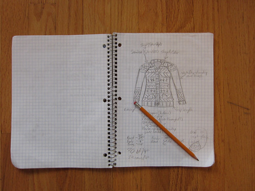
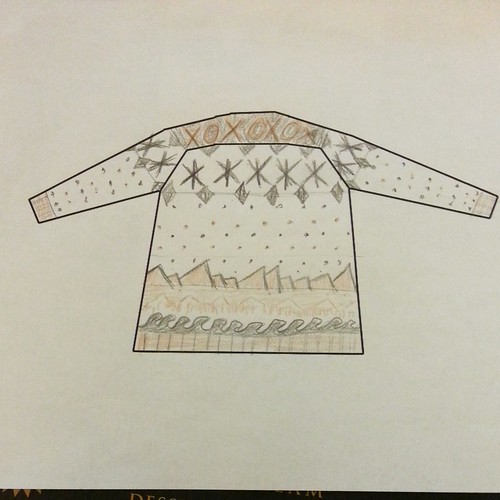
Before I get ahead of myself, here is a coloured sketch of the general sweater idea (this is the back of the sweater). You can more or less make out the waves, trees, and mountains rising from the lower edge of the sweater, and transitioning into... something. I didn't quite get around to planning every detail yet.
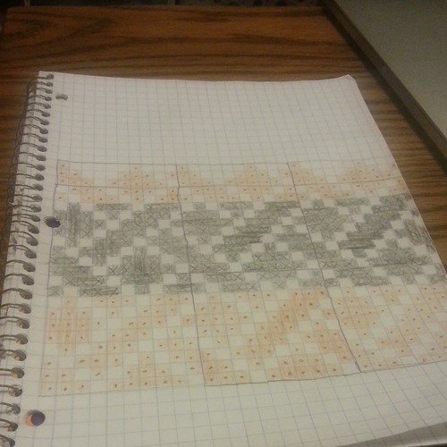
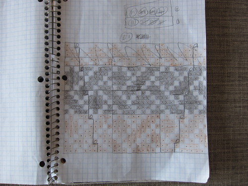
With that, and after some extensive colour-mapping, I got to work.
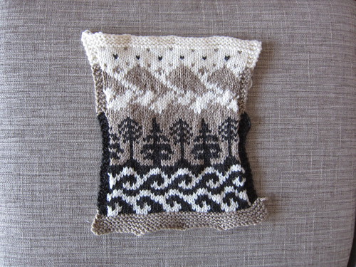
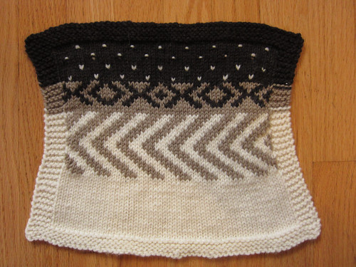
And wound up with a pretty decent swatch!
I did make some changes to the design as I went, but this kind of planning allowed me to re-check my gauge, and helped give me a willingness to modify motifs on the fly, since I had a pretty solid grasp of how the fabric would alter.
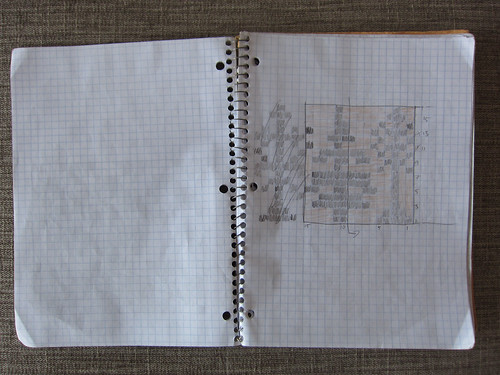
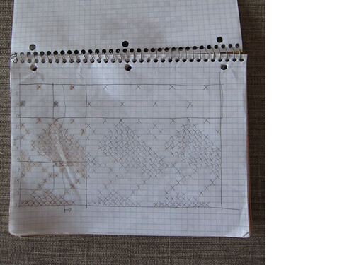
I'm going to leave you with a few more photos of my sketches for the time being, because I really do have to get back to work... Next time I promise I will have an actual progress update on the knitting of the sweater itself! (Hint: It's not done yet... there are rocky seas ahead).
Monday, March 16, 2015
Tuesday, March 3, 2015
Designing a sweater: Part 2
**I originally wrote this post for the Urban Yarns Blog on February 16, 2015. It is reproduced here with permission.
A few weeks back, I introduced a new project of mine with a little backstory. I left off that post with a picture of my initial sketch and key design elements.
Now, before I get too heavily invested in choosing specific motifs and stitch patterns, I like to work out a few swatches with the yarn. Sometimes I'll start swatching motifs immediately, if I know I'm going to be working with a yarn with which I am familiar. This begs the question: What yarn am I going to use for this sweater?
I wanted something in the 20-22st/4" range (DK to worsted), because I didn't want it to be too bulky (but also not so fine that it takes forevvvvvver). I prefer to work in wool, or wool blends, however the future wearer of this sweater does have moderately sensitive skin, so nothing too "traditional" - that means a superwash or merino wool yarn. I wanted to have a good range of colours to choose from (since I knew I would be working with neutral colours, it was very important to have enough colours to choose from). And finally, I wanted it to be relatively inexpensive, so none of my favourite top-shelf fancy hand-dyed, luxury blends for this project.
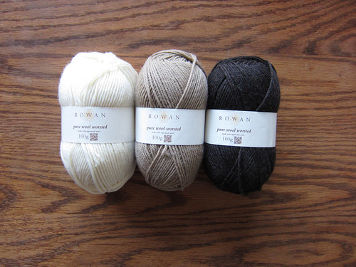
My final choice? Rowan Pure Wool Worsted. I'd consider it a light worsted, it is reasonably priced, comes in a huuuuuge number of colours, is superwash, 100% wool, and I kind of just wanted to give it a try.
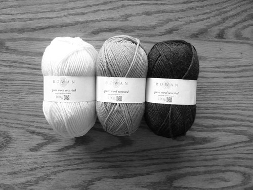
Choosing colours... Well, you may remember my earlier post on colour theory (note to self: work on part 2 of that series) where I focused on the importance of considering colour value when knitting colourwork. Well, knowing that I was going to be working three yarns that did not differ greatly in hue - paying close attention to value was especially critical for this project!
I basically just pulled out all the neutral options we had, and started by getting rid of the ones that didn't appeal. I immediately tossed the pure white and dark black, as I was worried they would be too dramatic. None of the greys were really calling to me, and my partner had expressed a desire for warmer tones in the sweater, so I opted to stick to creams and browns. I slowly whittled it down to three - no real rhyme or reason beyond ensuring I had a high, low, and mid valued yarn, and three colours that looked nice together.
For the record, the colours I chose are 102 (cream), 103 (light brown), and 110 (dark heather brown).
Next up was swatching. Well, the first phase of swatching. When I work on a large project, it is often an iterative process. In this case, I had a loose idea of the kinds of motifs I wanted, so I just drew from my mental stockpile of easy patterns and went nuts. I always like to swatch with the yarn in plain stockinette (sometimes in a few needle sizes), and then in each of the stitch patterns to be used in the item. Here, I had examples of low density (the lice motif at the top), high density (the crosses and naughts), and mid density (the chevrons) stranded colourwork motifs. This photo was taken post-blocking, and you can actually see quite clearly just how much firmer the fabric is over a high-density motif - this is clearly going to be a structural concern when planning a multi-patterned sweater (at least 5 or 6 different motifs).
Well, I think I have rambled on sufficiently for today... But as a teaser for next time, I'm breaking out my design arsenal...
Monday, February 16, 2015
Designing a sweater: Part 1
***I originally wrote this post for the Urban Yarns Blog on February 2, 2015. It is reproduced here with permission.
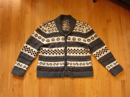
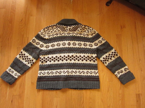
I've been asked to share a bit of a story with all of you. Well, a story and a bit of a discussion. I'm going to share my personal design process with you. This is how I work, and maybe the insight will be useful or terrifying... My partner and I were sitting around the house one day when she turned to me and said "you know that sweater of yours?" To which I replied "No. Which sweater?" "Oh, that grey and brown knit one in the bottom drawer that you wear." "You mean the one that doesn't fit, is kind of ratty, and that I really only wear when I'm deathly ill with a fever?" "Yeah, that one. I want one." "You want a ratty, sick-day, ill-fitting knit sweater?" "No, I want a nice, hand made sweater that looks like that one." Well, that was the start of it. But by no means the end. Here's the sweater, front and back. It's based on an Elizabeth Zimmermann seamless sweater, into which I crammed a bunch of different stranded motifs.
Next, we got to planning the new sweater. We plunked down in front of computer and started trawling Ravelry. Honestly, it wasn't terribly productive. There were existing designs that had some elements that my partner liked, but really nothing close to what she had in mind. So we let it mull for a few days, and came back to it later. "So, what do you think you want your sweater to look like?" "I don't know! You're the knitter, I have no idea what will look good." D'oh! Design mistake 101. People hire designers (graphic, knitting, software, whatever) because we are supposed to be experts. If people know what they want, why go to a professional in the first place? This time, I sat down alone and thought about my original sweater and made a list of what were the strongest, most identifiable features. Let's be honest, I can sit down and pick out the tiniest, most intricate of details, but I bet that those were not what were appealing. I basically came up with this list:
Basically, a more refined version of my sweater:
I've been asked to share a bit of a story with all of you. Well, a story and a bit of a discussion. I'm going to share my personal design process with you. This is how I work, and maybe the insight will be useful or terrifying... My partner and I were sitting around the house one day when she turned to me and said "you know that sweater of yours?" To which I replied "No. Which sweater?" "Oh, that grey and brown knit one in the bottom drawer that you wear." "You mean the one that doesn't fit, is kind of ratty, and that I really only wear when I'm deathly ill with a fever?" "Yeah, that one. I want one." "You want a ratty, sick-day, ill-fitting knit sweater?" "No, I want a nice, hand made sweater that looks like that one." Well, that was the start of it. But by no means the end. Here's the sweater, front and back. It's based on an Elizabeth Zimmermann seamless sweater, into which I crammed a bunch of different stranded motifs.
Next, we got to planning the new sweater. We plunked down in front of computer and started trawling Ravelry. Honestly, it wasn't terribly productive. There were existing designs that had some elements that my partner liked, but really nothing close to what she had in mind. So we let it mull for a few days, and came back to it later. "So, what do you think you want your sweater to look like?" "I don't know! You're the knitter, I have no idea what will look good." D'oh! Design mistake 101. People hire designers (graphic, knitting, software, whatever) because we are supposed to be experts. If people know what they want, why go to a professional in the first place? This time, I sat down alone and thought about my original sweater and made a list of what were the strongest, most identifiable features. Let's be honest, I can sit down and pick out the tiniest, most intricate of details, but I bet that those were not what were appealing. I basically came up with this list:
- Worsted weight (Cascade 220)
- Dark grey, dark brown, cream fair isle in pretty broad, clear bands
- Shawl collar
- Shirt-yoke (across the back of the neck)
- Lovely handmade wooden buttons
- Seamless, classic, Zimmermann construction
- Worked FLAT. Not in the round. That means there is purl-side stranded colourwork... (this is more of a personal note, not so much a visible design feature)
Basically, a more refined version of my sweater:
- Stranded colourwork, in three neutral colours
- Shawl collar
- Not too heavy a weight of yarn
- Cardigan with buttons
- Ribbing and the hems and cuffs
- Hip-length
- Not excessive bulk over certain areas (upper arms, bust)
- Maybe pockets and elbow patches
Saturday, December 13, 2014
Long time no post
Hey all, it's been a while eh? (I mean, when hasn't it?)
Long story short, school sucks and I miss knitting.
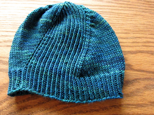
First day after term ended I cast on a hat for a special project, and cast off the next day. Still have to wash it, but gosh was that a quick, rewarding little knit.
Pattern is Windschief, yarn is Sweetgeorgia Trinity Worsted, which is just about the nicest worsted weight yarn I can think of.
Kind of a crummy photo - I think my camera is on it's last legs. Anyway, more to follow, I'm thinking I will walk through a fun little design project that I've got planned out.
Tuesday, November 18, 2014
***I originally wrote this post for the Urban Yarns Blog on November 11, 2014. It is reproduced here with permission.
Hey everyone, today (actually there will probably be a few posts in this series) we are going to start talking about colour. Not colourwork exactly (which you may know is a favourite pastime of mine), but some basic colour theory that holds true for all your knitting, and quilting, and drawing, and painting, and crafting, and just generally experiencing the world through a critical lens.
Ok, maybe you don't want to experience the world through a critical lens, so let's just say that this discussion might help you pick out yarns in the future. Good enough? Great, let's begin.
Our perception of a colour has three main elements: Hue, Value, and Saturation. Hue is what most people think of when they refer to a colour. Often represented on a colour wheel, most people know the primary colours* (red, blue, yellow), and secondary colours (green, purple, orange).
Hue is what we obsess over when we ogle Madelinetosh or Sweet Georgia. We will talk more about hue later, and its importance in yarn selection.
(Yes, I know that there are eight colours on that wheel, not the six I mentioned)
Saturation is related to the perceived intensity of a colour. You can add (imagine actually mixing paints on a palette) white to a colour to make a lighter tint, or grey to a colour to make a muddier tone, or black to a colour to make a darker shade.
But today I want to focus on Value. Value refers to how light or dark colours are in relation to each other (or rather, to a grayscale that ranges from pure black to pure white). Value is really critical to colourwork, as yarns with a similar value are harder to tell apart than yarns with very different values - regardless of their hue! In fact I would go so far as to say that value is the number of determiner of effective colourwork (bear in mind, I could choose some dreadful combination of hues, but still have an effective design).
(A monochromatic grayscale, from white to black)
Put bluntly, if you are working on a colourwork design (hey, ask one of our amazing staff nicely, and they will help you pick a great pattern...) that is worked in two colours, you want them to be of substantially different values. If you are working with three colours, you probably want them to be substantially different in terms of value. But as you add more colours, it does get trickier - er, this is also a discussion for later.
So, how do you apply this theory of colour value to your yarn selection? The technical term is "value testing", which really just means using method to assess whether or not your chosen colours are too close in value. Again, I hear you cry, 'how?'
Well the tried and true method is to squint. Simply put your yarns down on the table (ideally in good, natural lighting), and mush them up nice and close to each other, and squint. If, the more you squint, the more similar the value of the yarns seem to be be, then they probably are similar in value. If you can still easily distinguish between the yarns, you are likely on the right track.
If you don't feel like squinting in the yarn store, we thankfully have technology at our disposal. With a camera or smartphone, take a photo of the yarns in question, and convert it to black and white. Really, it's that simple. This conversion will make abundantly clear just how close in value your yarns are. To illustrate, here are two simple projects I knit.
The first has a high value contrast between the red and yellow yarns, as you can see in both the colour and black and white versions.
The second photo... not so much.
In the black and white version it is almost impossible to tell the two yarns apart. Which is more effective?
As a parting thought, I've applied the same treatment to the Rowan Pure Wool Worsted shadecard, and it's pretty interesting to see exactly what the range of values is (one of our hands down favourite yarns for its knitting properties and the fact that it comes in 56 colours...)
Anyway, I hope you've found this as interesting as I have, and would love to know what technique tips and tricks you would like to learn more about in the future! Drop us a line and let me know...
*Fun side note, the history and debate about the language of colour is a fascinating study. If you are linguistically inclined, I highly recommend reading into the universalist/relativist debate.
Wednesday, November 12, 2014
Plies and things
***I originally wrote this post for the Urban Yarns Blog on September 14, 2014. It is reproduced here with permission.
Today we’re going to chat a bit about yarn construction, specifically the significance and meaning of different types of plied yarn. First off, I want to put to rest a common misunderstanding: the number of plies in a particular yarn has no inherent bearing on its gauge. That is to say, you can have a single-ply laceweight yarn, a single-ply bulky yarn, a 6-ply fingering weight yarn, an unplied worsted weight yarn, etc…
The concept of plies corresponding to gauge was at one point something of an industry standard, but modern manufacturers have since moved away from this. Historically, there was a standard-ish base, unplied weight for a single strand of yarn, so that (for example) a 4-ply yarn (made from four individual strands spun together) would be roughly the same from mill to mill to mill. This can be still be seen in some manufacturers labelling yarns as 4-ply (which corresponds to fingering or sock weight) or 6-ply (comparable to sportweight), but that is about as far as it goes.
So! For modern yarns, plies are independent of gauge. This really isn’t a big deal, as pretty much every manufacturer lists the gauge straight on the yarn label. For todays discussion I grabbed a few yarns out of stash to take a look at. We have some single-ply, 2-ply, 3-ply, 4-ply, and…. other. Yeah, some yarns are a bit more special – we’ll talk about them later.
The single-ply yarns we have here are Schoppel Wolle Zauberball (lace weight) and Noro Kureyon (worsted weight). You can see that they are both constructed of a single strand of yarn, which is composed of many individual wool fibres that run parallel to each other. Both of these yarns have a light to moderate twist and are relatively soft in the hand, but you can see that the red Kureyon is much hairier and less densely spun than the smoother, tighter Zauberball.
The two-ply yarns I chose are Harrisville Designs Highland (Aran weight), Koigu KPPPM (fingering weight), and Rowan Kidsilk Haze (fingering/laceweight). These three yarns are composed of two plies of yarn spun around and around each other. The Highland and the KPPPM are both 100% wool and have a relatively smooth surface compared to the Kidsilk Haze which is mohair and silk, and in which each ply is composed of a silk core, with the mohair spun more loosely into and around it, giving the unique “haze”. You can also see that the KPPPM has a very tight twist compared to the more relaxed Highland and Kidsilk – I’ll talk more about that later.
Next up, the three-ply yarns are a mystery acrylic yarn from deep in my stash, and Habu A-21 Silk Stainless Steel. This really shows the possible range of gauges available from the same number of plies. It’s a bit tough to see, but the Habu has two plies of silk, and one of an ultra-fine stainless steel all spun together.
Four-ply yarns! We have Cascade 220 (worsted weight) and Madelinteosh Merino DK (DK weight). These are actually quite similar, but a distinguishing factor is the tightness of the spin – you can see that the plies of the Madelinetosh spiral around each other much more tightly than the Cascade. You might also be able to tell that the Madelinetosh looks smoother – it is a superwash yarn and has been treated to smooth the surface of the individual yarn fibres to prevent felting.
Finally, we have some unique constructions. First up is a mystery novelty yarn. It seems to have five or six plies, all made of a different fibre. Next is Habu Merino 4P. The Habu is really interesting, as it is four plies of merino (and each ‘ply ‘ is actually a 2-ply strand unto itself!), which are not spun together, but are wrapped with a very fine two-ply silk thread. So this is technically a 10-strand yarn that is a light fingering weight!
There are several other unique constructions, and if there is enough interest, I might take a closer look at some of them for you! So, what does all this mean, other than numbers are kind of meaningless? Well, as a general rule, the greater the number of plies, the more durable the yarn. This means plied yarns will pill less than unplied yarns, and generally wear better. So socks or other high-wear items are best worked in a plied yarn. Similarly, the tighter the twist in a yarn, the more durable the fabric will be.
The flipside is that a looser plied (or unplied) yarn fabric is often a bit softer in feel (and in wear). Now, I haven’t tested this, but it also stands to reason that a loosely, or unplied yarn will felt easier than a tight, high-ply yarn. A more tightly plied yarn will also produce a fabric with different drape and gauge than an unplied yarn, and a really tightly plied yarn might start to twist and loop back on itself while you work with it. Also, smooth plied yarns tend to have better stitch definitely than unplied hairy yarns – so choose wisely when working something with a lot of detail…
These are all simply factors to consider. There is no perfect yarn, only yarns that are more or less suitable to a specific project. This information is best absorbed through experimentation, so it’s great if you can learn to identify different types of yarn construction, and play with using them in different ways in your work. Now, I know this is a lot of information to take in, which is why we would love to help you pick out the best yarn for your next project!
Thursday, August 7, 2014
Never not custom. Or, I always know best.
I've got a nasty habit.
I can't for the life of me follow a pattern without making *some* kind of changes. Sometimes it's just one or two minor shifts; adjusting for size, colour change, tweaking a motif, you know.
Interestingly, I also find that I will almost without fail, re-chart the patterns I work from. If there's no chart, you can be sure I'll sit down and chart out the pattern. Often if there is a chart, I will copy it down into my chart notebook, which has a nicely sized grid that makes it much easier to read the chart from a distance, as I find they can be quite small and tough on the eyes as printed. Sure I could just scan or copy the page and then enlarge it, but that doesn't solve all my problems.
You see, I know better than anyone else. Not about *everything*, no. But when it comes to my knitting? Yeah, I know best. Particularly when it comes to charted patterns (lace, especially particularly), I have a certain set of chart symbols to which I adhere nigh-religiously. They make sense to me. I have found that they make sense to most other knitters as well, and they are by and large quite close to the "standard" symbol sets used by most designers.
I really find it quite a time-saver to take a few minutes and re-chart the charts. I don't waste time thinking "oh, what does *this* symbol mean in this pattern again?" I can glance at my larger than average charts, quickly find my place, and knit on without having to waste any time or thought on interpreting the pattern. Occasionally I will forgo this, if the charts are quite minimal, or nicely printed, or happen to use my preferred symbols.
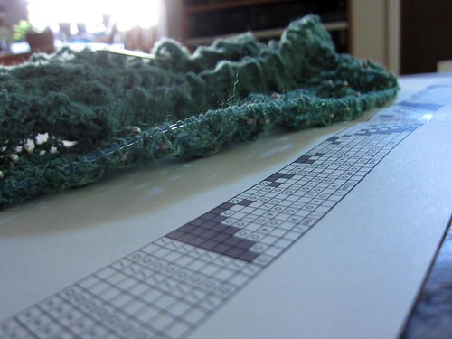
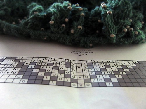
In this particular pattern... I need not name names, the choice in symbols is somewhat baffling. This particular chart is also quite large, so I ended up drafting it in Excel, and printing it on a larger sheet of paper, so as to avoid cutting and pasting, or breaking it up across multiple lines.
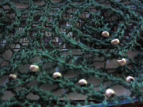
Speaking of this pattern, I'm down to the final chart (and yes, I've modified it... more beads!).
16 rows to go.
Currently 800 sts/row, and growing rapidly.
Hate to break it to you, but the full finished photoset for this one probably won't go live until next September, as it's a very, very, very, extremely special project.
Sunday, July 20, 2014
The re-roll...
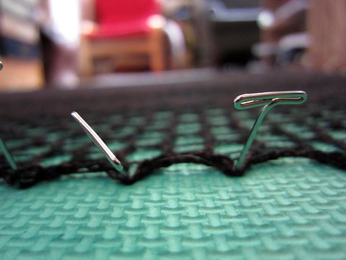
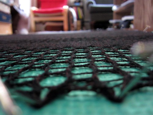
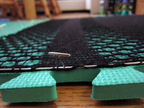
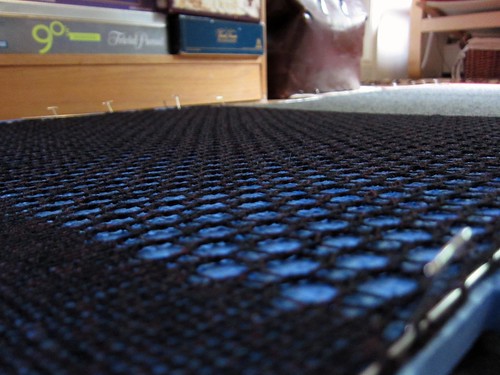
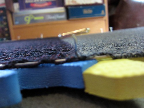
I wasn't totally pleased with my finishing work the first time around, so I decided to reblock this project. This is also further proof that my blocking wires are one of the best investments I've ever made (with regards to me knitting). If you often need to block straight lines, or any lace, they are invaluable, they will save you time and frustration, and bring your finishing to a higher, professional level.
Now, these are the clean, crisp lines I had in mind!
Every angle has some great new texture and lines to get lost in.
I can't wait to be able to share this project with you all, I know you're going to love it.
Now, these are the clean, crisp lines I had in mind!
Every angle has some great new texture and lines to get lost in.
I can't wait to be able to share this project with you all, I know you're going to love it.
Saturday, July 12, 2014
Small details
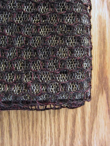
Ends woven in, blocking done in record time (should maybe have taken more time in fact to avoid scalloping, oops...)
Coming along nicely, I think.
Sunday, July 6, 2014
No work, no play
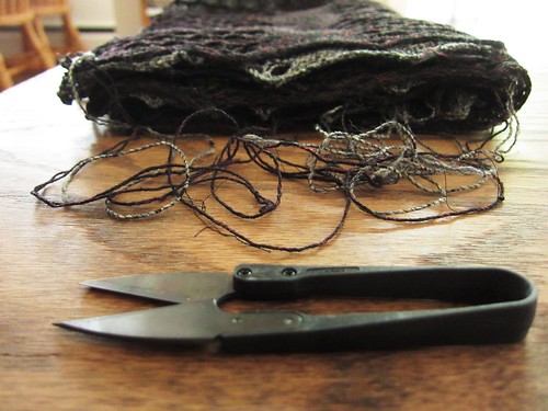
It's all fun and games until someone has to weave in all the ends...
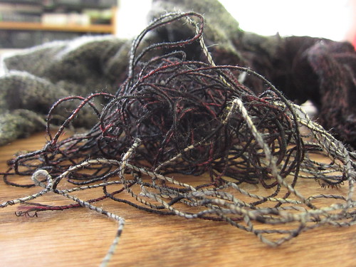
On a completely unrelated note, I love Habu, but man their quality control sucks.
Subscribe to:
Posts (Atom)